The air is thick with talk of AI. Every day brings news of incredible advancements, from sophisticated language models to the promise of autonomous AI agents. Beyond all the talk we consistently hear from customers that they want AI to deliver real world business value.You want AI that isn’t just assisting, but actively driving work across your entire organization. Agents that seamlessly integrate with every system, understand the unique context of your business, and execute tasks with trust and predictability.
Welcome to the age of the Agentic Enterprise.
At Workato, we call this the Agentic Enterprise – an organization where AI agents are embedded across every system, role, and process, not just to assist, but to execute, adapt, and unlock new opportunities. This isn’t just about making tasks faster; it’s about reimagining how work gets done, from customer experience to internal operations. We believe it is the future of business.
What’s holding things up?
Today many businesses are experimenting with agents but have not managed to deploy them broadly and realize the promise of the Agentic Enterprise. Anyone who has worked on introducing new technology to an organization knows the road from pilot to production is not always easy.
Common issues we hear from customers include the challenge of fragmentation or agent sprawl. Different applications are introducing their own agents, creating a landscape of disconnected tools that lack a holistic view of the enterprise. Imagine having a marketing agent that doesn’t talk to your sales agent, or a customer support agent unaware of critical supply chain information. These isolated agents, much like individual apps operating in silos, can lead to unpredictable, uncontrolled, and ultimately ineffective AI deployments. Think of it like this: you have a team of incredibly talented individual players (the AI models), but without a coach and a playbook (an integration and orchestration platform), they can’t work together effectively to win the game.
These agents also are not as smart as they need to be and often lack the intrinsic knowledge and context of your specific business. Generic AI might be able to answer a question, but it won’t understand the nuances of your unique workflows, your specific customer relationships, or the intricate details of your internal processes. Imagine asking ChatGPT to manage the lifecycle of a lead across multiple systems like advertising platforms, marketing automation, and Salesforce, with many varying users and roles.
Another big topic from many customers is IT security and compliance. Do agents have the right guardrails in place to protect sensitive processes and data? Are tasks completed in a predictable repeatable fashion that can be audited? CTOs recognize that they can’t simply trust general-purpose AI to drive critical enterprise systems and processes.
It is clear the industry needs an approach that delivers on the promise of agents and overcomes sprawl, lack of context and trust issues.
The Agentic Stack: The architecture for success
To resolve these challenges and truly unlock the power of the Agentic Enterprise, a robust architecture that reimagines the tech stack and breaks down silos is essential. It must bring the worlds of AI and existing data, apps and systems together. We envision an Agentic Stack that delivers the following key capabilities
- Enterprise Orchestration: Connect agents to your data, apps and systems and seamlessly coordinate how they all work together with existing workflows to get the job done.
- Enterprise Context: Allow agents to apply reasoning and intent in the specific context of your business.
- Enterprise Skills: Leverage existing workflows as trusted, tried, and predictable building blocks for your custom agents
- Enterprise Trust: Ensure security, governance, and reliability for your agentic initiatives.
Introducing Workato One: The Foundation for your Agentic Enterprise
On March 27th at our WorkAI event we announced Workato One an Agentic Stack designed to be the foundation of your Agentic Enterprise.
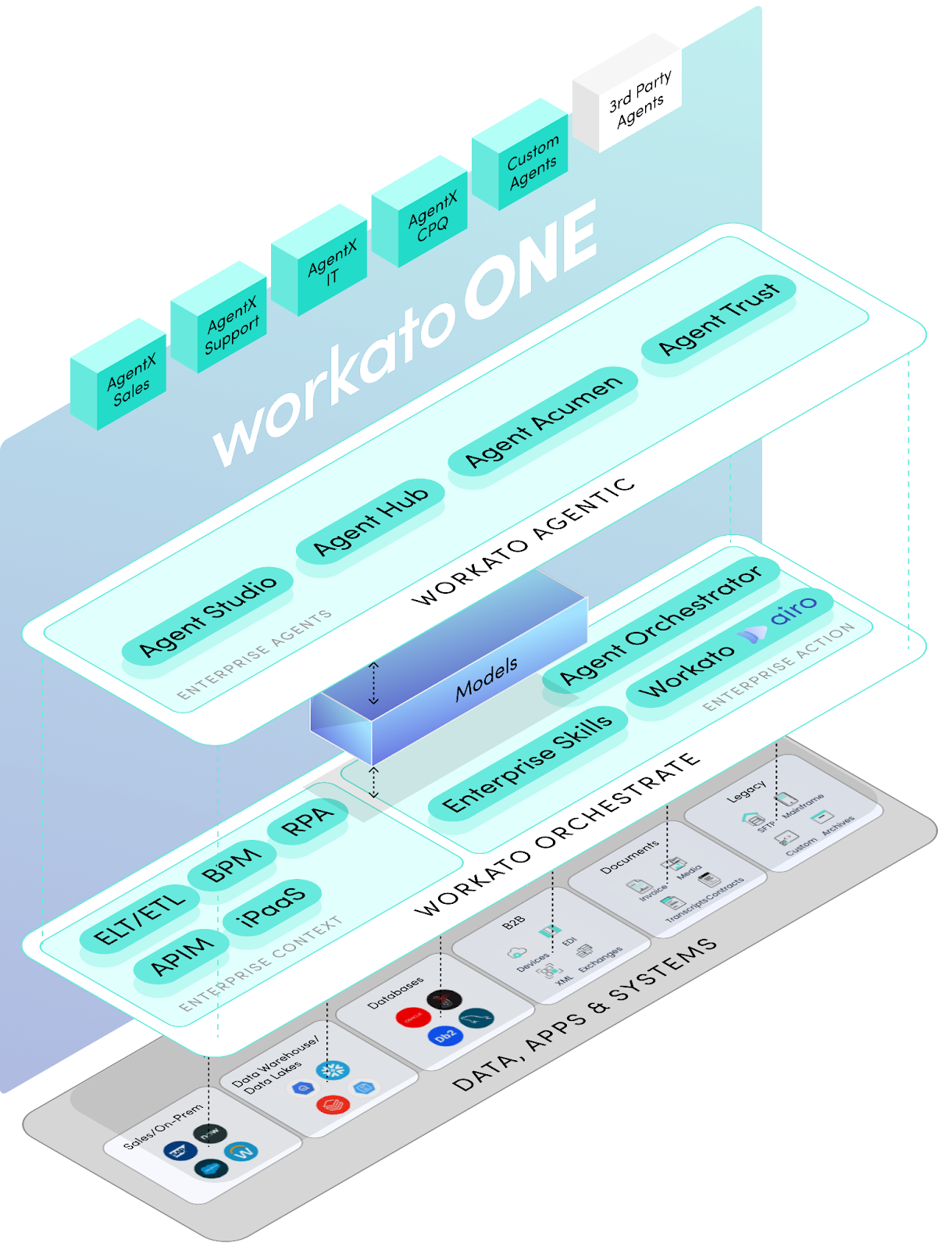
Workato One includes capabilities built around two core solution areas:
- Workato Orchestrate: Focuses on integrating and orchestrating data, applications, processes, and user experiences to deliver full enterprise context across knowledge, transactional, and process sources in real-time. It also enables building enterprise skills to predictably take multi-step actions – there are 635,000 such skills as part of the Workato community today and more are added daily.
- Workato Agentic: Extending the Workato Orchestrate platform, it introduces a foundation to build and manage agents that bring these enterprise skills and context together with the governance needed to execute business operations at the core of the enterprise.
Lets start with what’s new for Workato Orchestrate which has been a leading iPaaS solution for many years already. Two new important capabilities in this announcement include:
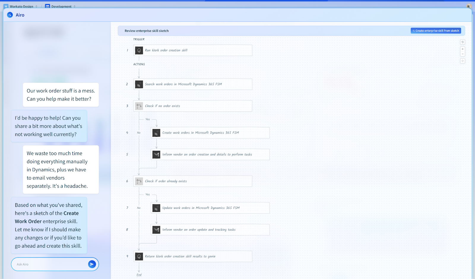
- Workato AIRO™ (AI-driven, Intent-based, Real-time Orchestrator): In the same way AI helps software developers write better code faster, AI can help business people solve operational problems too. Workato Airo turns ideas into enterprise-ready solutions and manages complex logic and multi-app solutions with ease. It supports the full lifecycle of ideate, sketch, test, and deploy.
- Agent Orchestrator: Today no vendor delivers every SaaS app an organization needs and in the same way no vendor will deliver all the agents a customer needs. There will be a landscape of agents. Agents from Workato. Agents from SaaS vendors like Salesforce and Workday. Agents from platform vendors like Microsoft and Google. Custom agents built with tools like langchain. The Agentic Enterprise will be heterogeneous and agents will need to work together. That’s where Agent Orchestrator comes in with the ability to co-ordinate work across agents of all kinds no matter who developed them. It also enables users to collaborate with agents like any other co-worker in Slack or Microsoft Teams.
Moving on to Workato Agentic our completely new offering delivers everything needed for enterprise ready agents. It includes the following four capabilities:
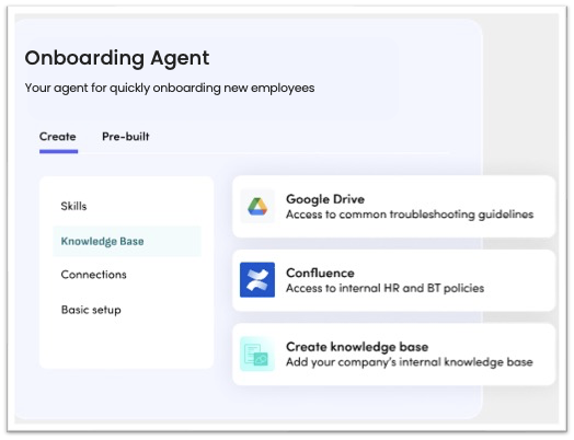
- Agent Studio: We have always believed that powerful tools don’t need to be hard to use and building agents is no different. Agent Studio is a low-code, no-code tool to build and configure enterprise-grade agents for the custom processes that matter to you. Agents can be defined with any combination of enterprise skills, knowledge bases, chat interfaces, and LLMs.
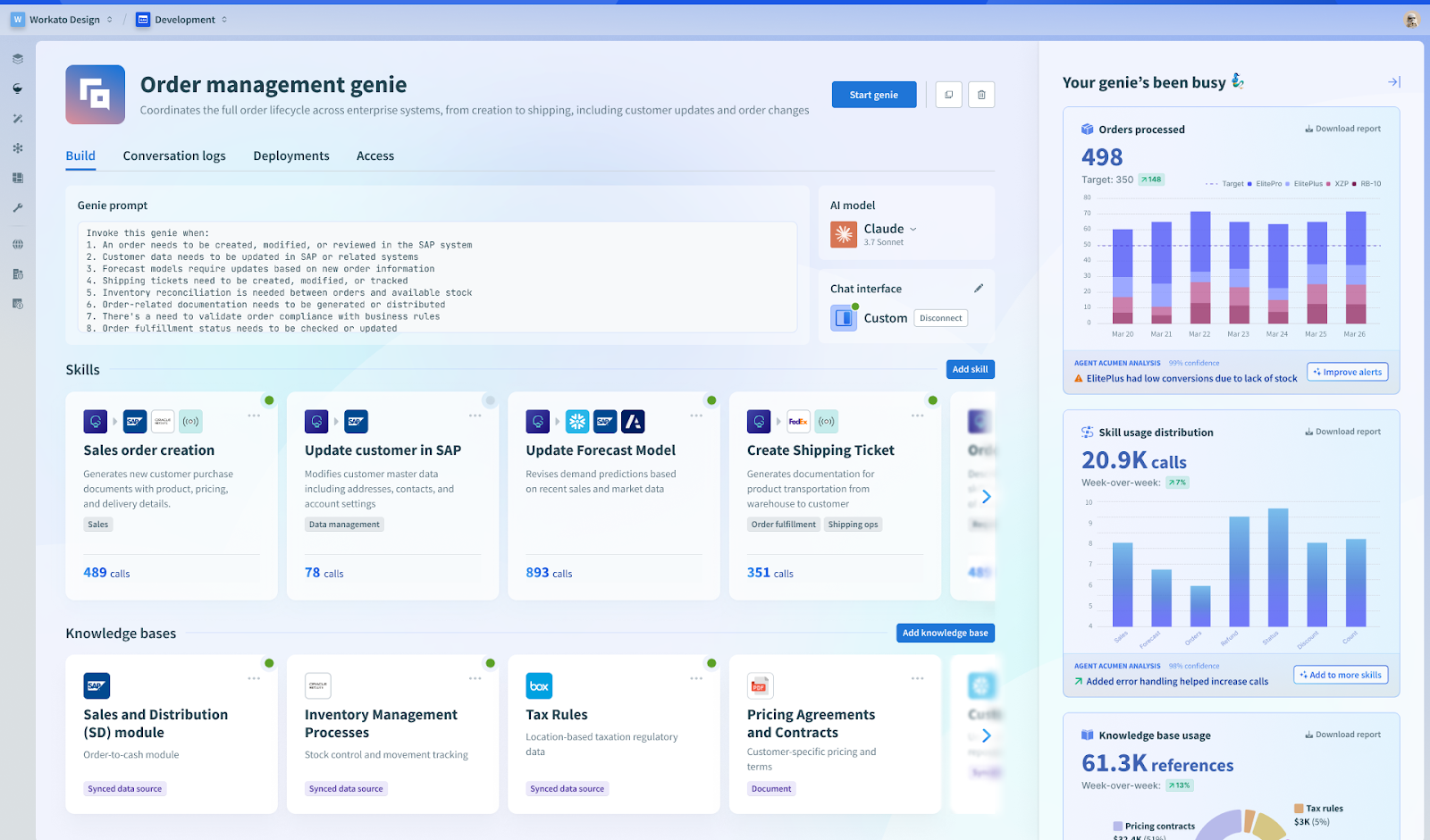
- Agent Hub: We talked about it already, agents need skills, enterprise knowledge, connections to apps and configuration to do useful work. Agent Hub lets you define which skills agents have. It lets you connect them to knowledge bases so agents can securely retrieve and act upon relevant information. It’s the place you wire them up to all the apps and systems they will work with.
- Agent Acumen: Data is the lifeblood of agents but is not always well organized and easily found inside an organization. It often lives across multiple systems in fragmented schemas. Agent Acumen helps connect to, assemble and organize the right data your agents need.
- Agent Trust: Built-in enterprise security and governance capabilities unified across agents, processes, and systems and data. Agent Trust includes Agent Auth™ providing patented agent role-based access control. All running on a secure and compliant native cloud foundation trusted by enterprise IT
In addition, we announced that Workato Agentic will support Model Context Protocol (MCP) , an open standard created by Anthropic. This enables standardized access to thousands of prebuilt Workato recipes and enterprise skills for agents to orchestrate business actions. Workato MCP enables secure cross-agent collaboration across agents built on Workato One, any third-party agents, and MCP servers
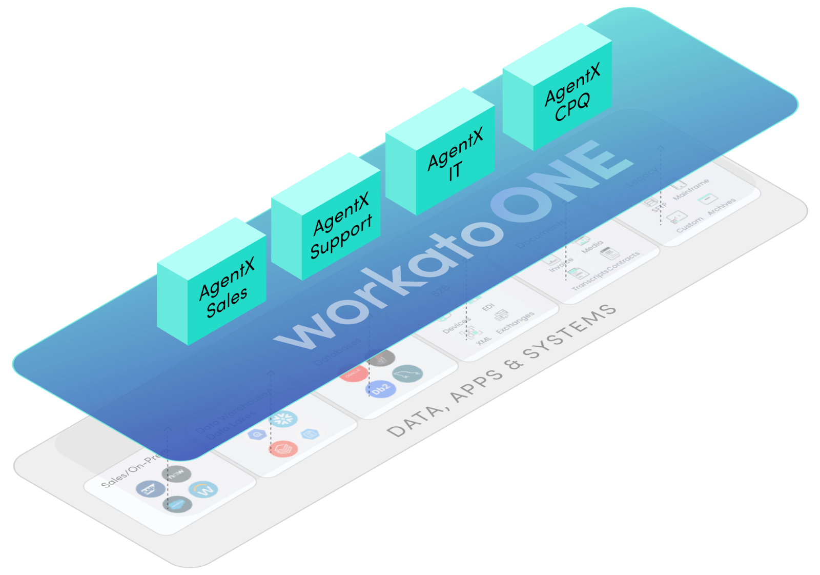
Introducing AgentX Apps: Ready-to-Deploy Agentic Apps that solve real problems
On top of the Workato One platform we are also launching AgentX Apps, the world’s first intelligent, cross-functional agents with enterprise-scale trust. These apps integrate seamlessly within key business functions and are built to support secure and agile operations.
As an example lets take a look at AgentX IT shown here being accessed via Slack
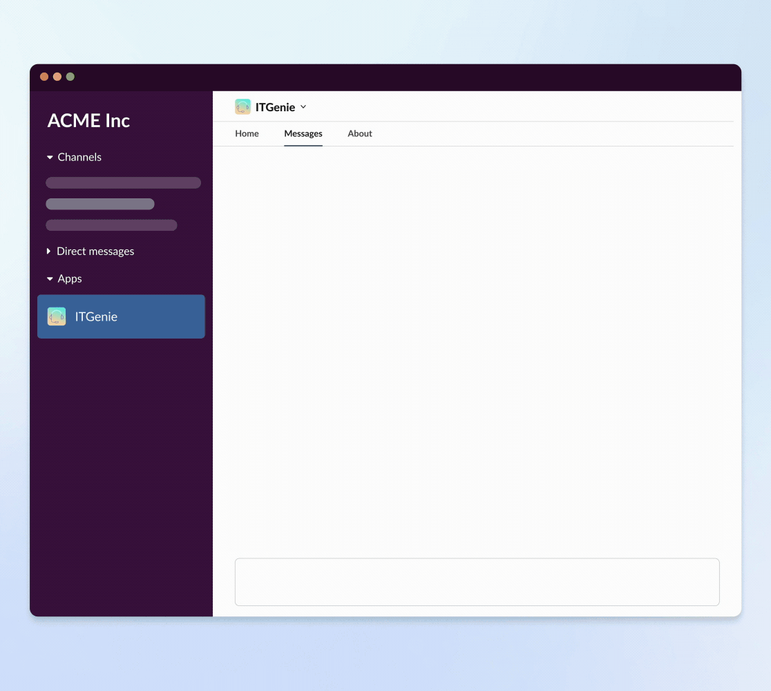
It uses a number of discrete agents to support the key processes behind an IT help desk. Things like the ability to deflect help desk calls with answers to user questions. Answers that go beyond the generic and that take your enterprise context and configuration into account. Software Access Management to provision users with the apps they need following your procurement and approval guidelines. Automated access and group management lets users self-serve again with the rights checks and balances. Because it’s built on Workato One you can use all the power of the platform to add new skills and tune AgentX IT to precisely match your needs.
Workato One: Bringing the Enterprise to AI
We understand the pressures faced by CIOs and CTOs today. The demand for AI innovation is immense, but so are the concerns around security, reliability, and integration. Workato One and the Agentic Enterprise offers a path forward where you can move fast and innovate with AI without breaking everything. You can leverage your existing investments and trust in a platform that understands the complexities of enterprise IT. It’s time to move beyond the hype and unlock the true power of AI – not in isolated tools, but across every system, every team, and every decision.
We believe that AI isn’t just the future of work. It’s the next era of how business gets done. And Workato One is the platform that will make it happen.
The Agentic Enterprise Starts Now.