A new experience with more ways to work together

Automation of business processes has been rapidly scaling up. And with the fallout from the pandemic last year, we have seen an urgent acceleration in automation and digitalization initiatives across all industries, geographies, and company sizes.
There has been a 2.1X increase in the number of business processes automated by customers; more than two-third of customers have automated business processes across all departments – HR, Marketing, Sales, Finance, IT, Support, Product/Engineering.
We are continuously making improvements, big and small, to the UX to enable all your teams to work together to build more automations, faster. Earlier this year we launched several updates to the UX to improve usability and productivity e.g. copying and pasting multiple steps, projects to organize assets and teams.
We are rolling out some exciting changes to put you in control of your experience, and get a 360 view of your recipes, connections faster with lesser clicks.
Work in widescreen
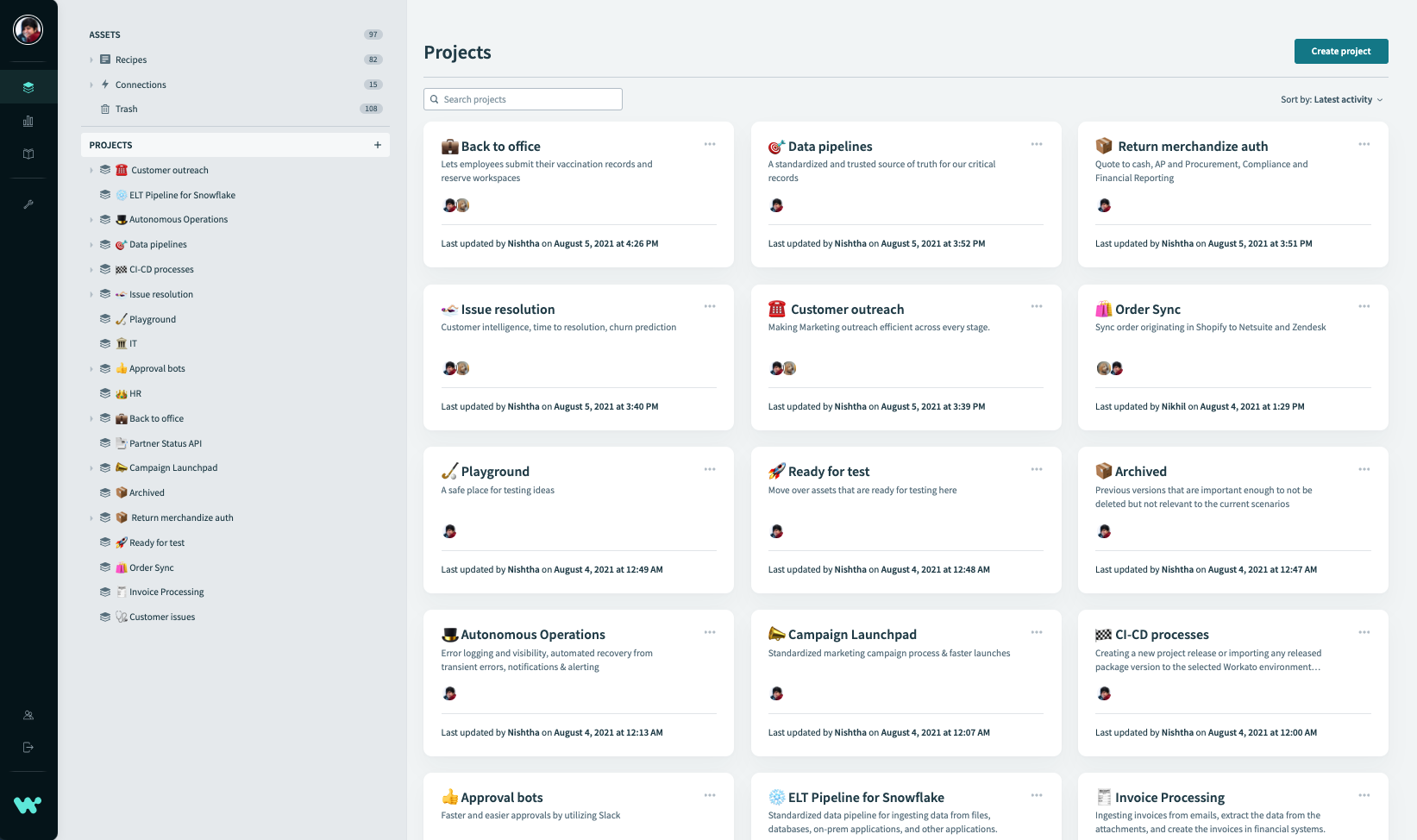
The first thing you’ll notice is that we’ve spread out a little. The newly designed layout takes advantage of the full width of your screen to show more of what’s going on in your workspace.
- The Project overview screen gives you a birds-eye view of all projects in your workspace.
- The project browser on the left is wider to accommodate longer project names e.g.” Employee onboarding – Day 1 activities”.
- Occasionally you will run into project names that are really long or a nested folder structure where the browser panel width may not show the full name. In those situations, you can simply hover over the project or folder name for the complete view.
- As a result of this layout, you will also be able to view more columns and data in the lookup table; improved readability for SDK connector code, and more.
Fully responsive
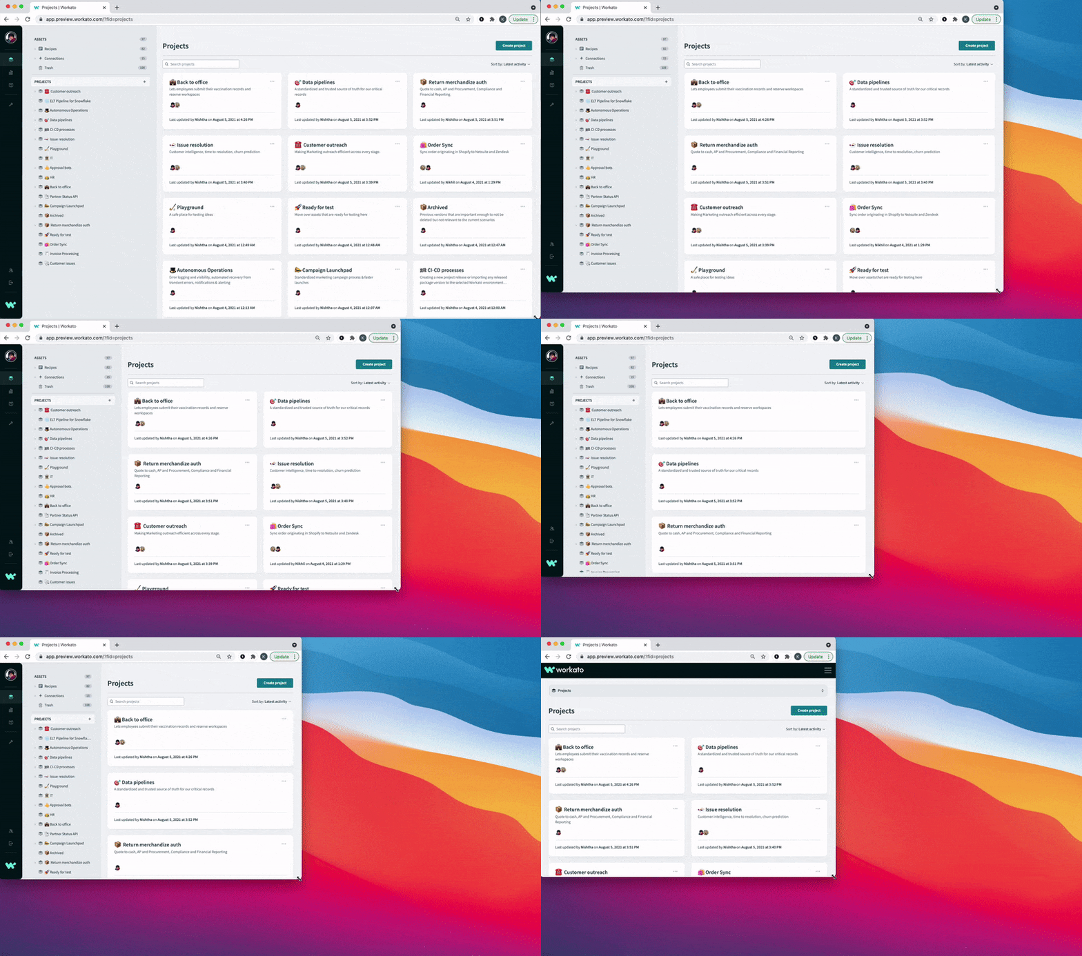
But don’t worry if you’re working on a smaller screen or resize your browser window. The new design is fully responsive to adapt to whatever screen size you need.
On your left
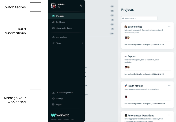
The navigation menu has shifted to the left of the screen and hides away until you need it. Hover and you’ll see that we’ve moved things around a little to get you to common screens faster.
- At the very top, the project and environment switcher lets you move between multiple Workato instances. For those of you with a lot of workspaces, we’ve made things easier to manage with a search option and a dynamic list of your ten most recent spaces.
- Tools for building occupy the top half of the workspace-level menu. Navigate projects, the reporting dashboard, our community library, and more.
- The bottom half of the navigation bar focuses on managing the workspace itself, with settings, and team management.
Wish I was a little bit taller
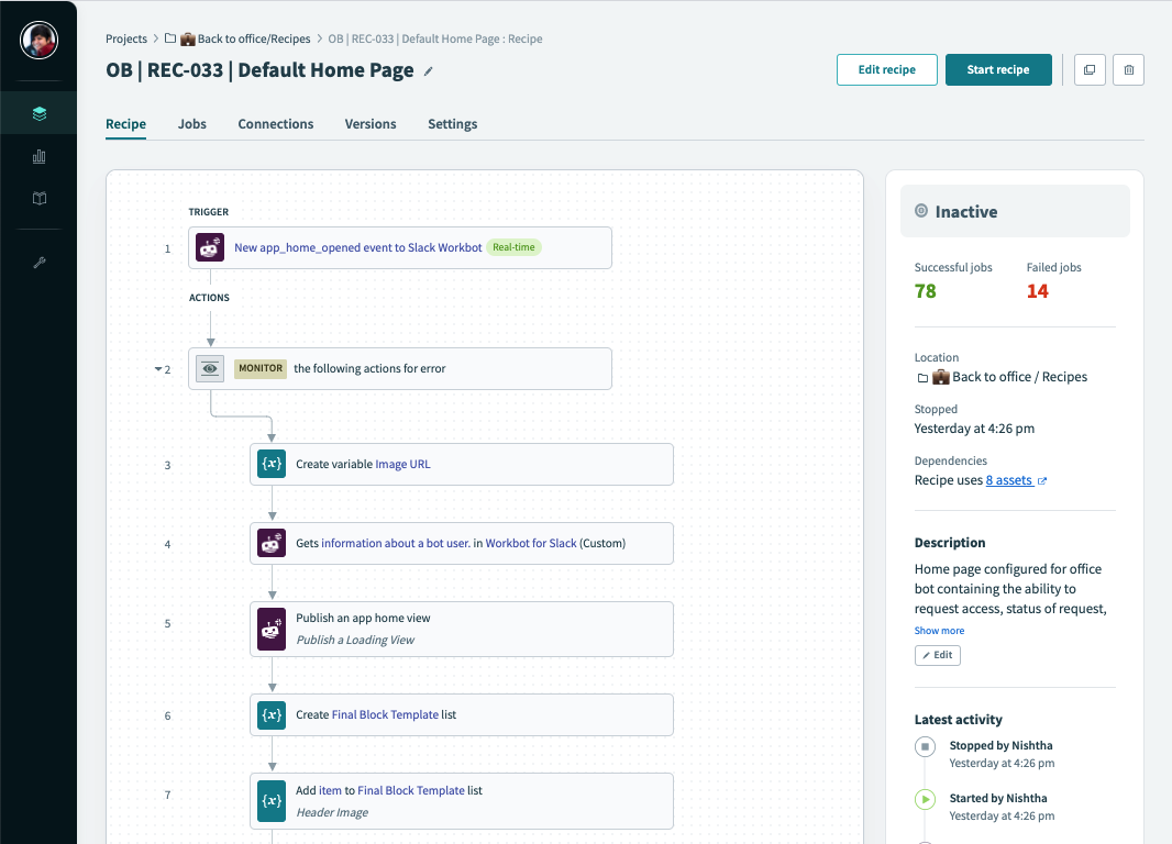
We’ve also optimized key views for vertical space. You build recipes from top to bottom, and the more of a recipe you can see on the screen at one time, the easier it is to read. For this reason, the navigation menu has a new home at the left of the screen, and summary information has been moved to the Essentials widget on the right. These changes help to bump the core information you need up to the top of your screen.
The essentials at your fingertips
Workato users aren’t just building more than before, they’re also more likely to collaborate with other team members on a recipe. The last 18 months have taught all of us a lot about the need for effective collaboration at a distance. When you’re coming back to a recipe you’ve worked on, or a connection you want to troubleshoot, you need to know, at a glance, what’s been going on.
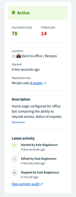
Recipe 360
- Vital signs – know if the recipe is active, and when it was last started or stopped
- Know the why – a description for the recipe to help your team understand what it does make sure any future collaborators are on the same page
- Work together – see who made the three most recent changes, and when. Knowing another team member has recently updated the recipe helps you communicate and prevents doubling up of effort or working at cross-purposes.
- Understand relationships – see a recipe’s dependencies at a glance. One click to a full dependency graph.
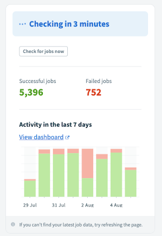
Job 360
- Get the report card – see an instant count of successful and failed jobs
- Watch the countdown – for polled trigger recipes, see how long until the next update, or force an immediate update with one click.
- Know the latest – chart the most recent 7 days of activity. One click to a full dashboard.
- Pick up where you left off – for inactive recipes, see the point in time a recipe will look for trigger events when it resumes.
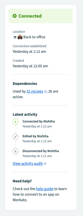
Connection 360
- Vital signs – See if a connection is currently connected, when it was originally created and when the current connection was established.
- Work together – see who made the three most recent changes, and when. Knowing another team member has recently updated the connection helps you communicate and prevents doubling up of effort or working at cross-purposes.
- Understand dependencies – see how many recipes use the connector, and how many of those are active. One-click to a full dependency graph.
